Colorpicker
Visible when you click any color preview
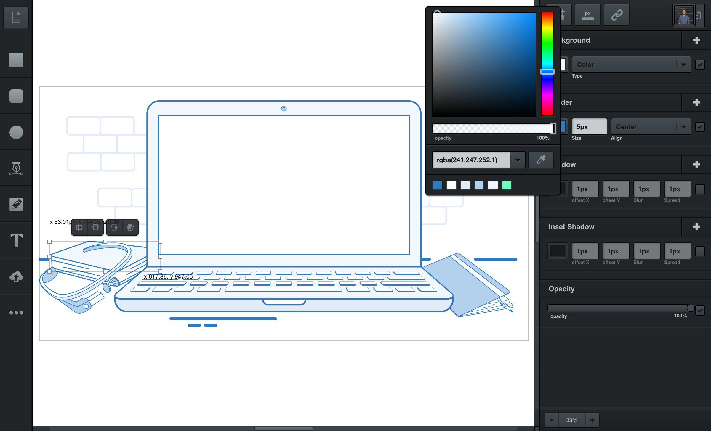
The color picker will appear after clicking any color preview. You’ll find these color previews inside filters, like backgrounds or borders.
To close your colorpicker, just click outside of it (or hit the enter or esc key).
Hue Slider
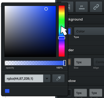
The hue slider, found on the right side of the colorpicker, looks like a rainbow spectrum and controls the hue of your color. Click and drag the hue slider to set the colorpicker’s base color.

Color Panel
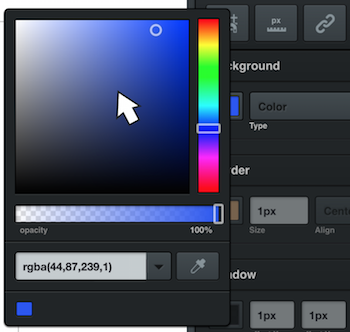
The larger color panel on the left lets you choose the tone of the hue you’ve set. Just click (or click and drag) in this panel to choose your color.

Opacity
The opacity slider determines how opaque your color is. It’s located near the bottom of the colorpicker.
There are a few different ways to adjust opacity. You can click and drag the handle, or click the opacity’s number to type in a percentage.
When you’ve clicked the opacity value, you can also use your up/down arrow keys to increase/decrease the opacity’s percentage. For larger increases/decreases, hold the shift key while pressing the up/down arrow keys.
Color Mode
Underneath the opacity slider is a drop down menu where you can set the color mode. There’s a choice between between RGBA and Hex color modes.
RGBA stand for the red, green, blue, and alpha (“alpha” means opacity  ). Hex is also a common color mode, but it does not include opacity in the color’s value.
Eyedropper Tool
To the right of the opacity slider is the eyedropper tool. After clicking the eyedropper tool you’ll then be able to click and select any color in your workspace.
With a magnifier next to your mouse, find the color you’d like to set, then simply click to set.
Frequently Used Colors
For easy selection, 18 of the most frequently used colors in your design will appear on the bottom of the colorpicker.
