How To Create an Infographic
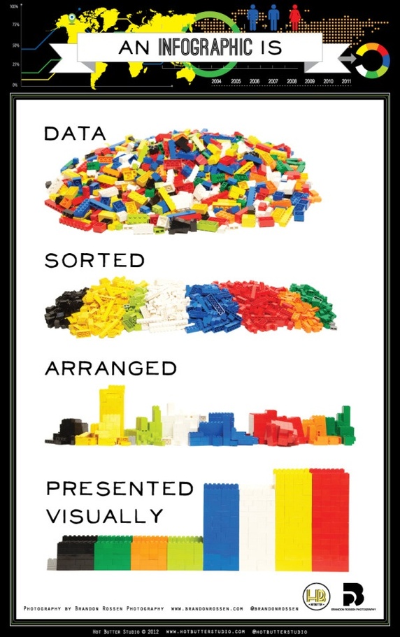
Infographics deliver jam-packed information to viewers in bite-sized visual snippets to make messages easily digestible. Like the name suggests, infographics are a combination of data and design. They’ve become an immensely popular way to display researched data to an audience – you can find an infographic for just about everything.

Key Components of an Infographic

- Presents information efficiently and concisely. An infographic is ineffective if its information is jumbled and confusing. A good infographic has arranged the flow of its information for quick understanding. Content elements can include statistics, references, facts, and time frames.
- Easier to understand than words alone. Infographics simplify complicated concepts, so graphics should enhance and complement the text being used. If the information is already easily understood through words, there’s no need to create an infographic.
- Visually pleasing and engaging. Usually, less is more. Keep your designs simple so that they don’t take away from the message you’re trying to convey. Visual elements include graphics, color palettes, and icons.
- Combines data and design to deliver message. A balance of both information and graphics are needed.
7 Common Types of Infographics
Statistical. Illustrates data through charts, graphs, tables, and/or numbers. Used to communicate metrics or to tell a story through numbers. Examples include surveys, business reports, statistics on a subject or event, and data-driven stories.

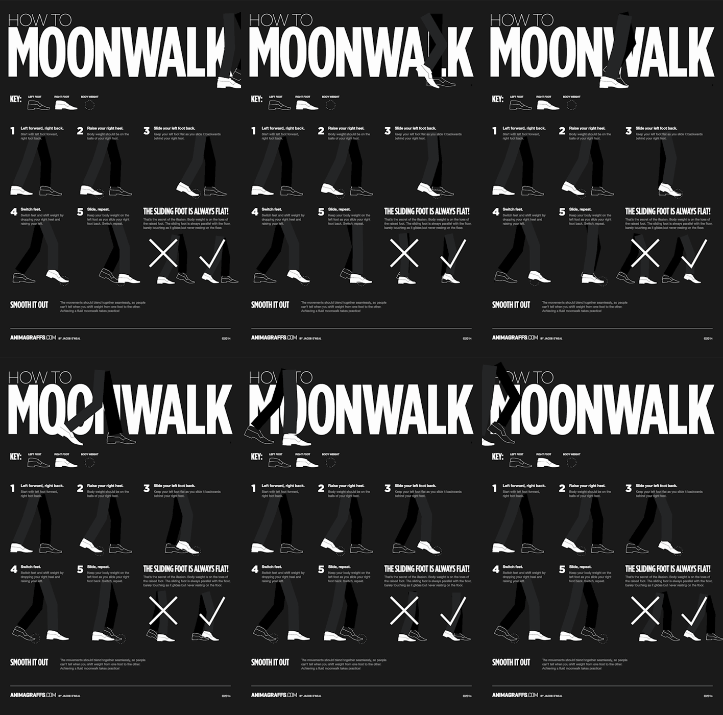
Process. Leads reader through a flow of information through either a linear or branching sequence.

Chronological. Tells a story or presents information through a timeline.

Geographical. Presents location-based information.

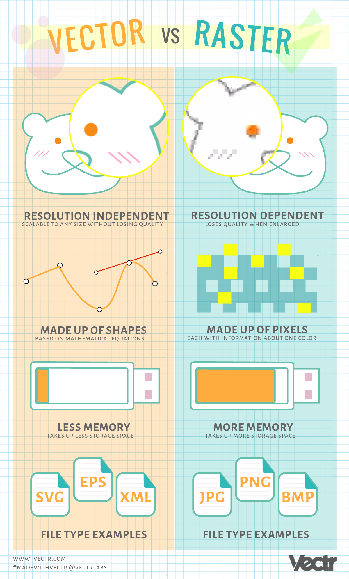
Versus. Compares and/or contrasts two different things such as products, places, theories, objects, etc.

List. Sums up text into icons, illustrations, lists, and/or bullet points. Usually, text-heavy messages are easily translated into brochures, guides, and posters.

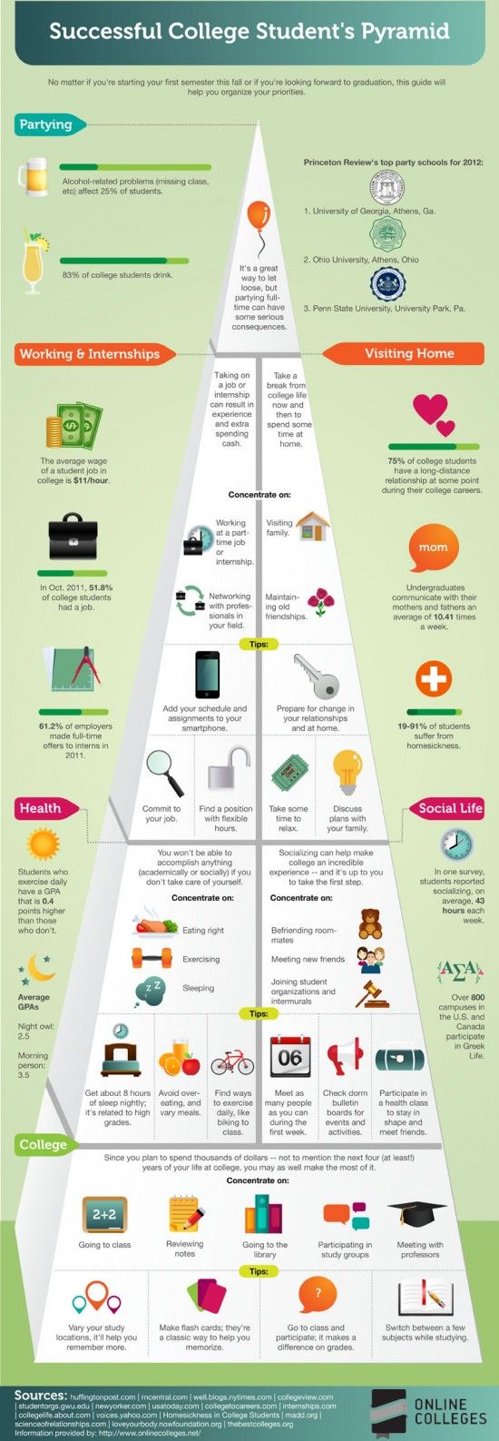
Hierarchical. Separates data into different levels according to rank while showing how each level is related to one another. Pyramid charts are the most common type.

4 Steps to Creating an Infographic
Gather all your data. Be sure that your data is factual and can be backed up with evidence from reliable sources. Keep a list of your references to include on the bottom of the infographic.
Put your data into context. Tell a story with your data that is interesting to your readers or list out the steps of a process. Bring something original that hasn’t been done before by doing a quick search of what is already out there.
Design the infographic. Less is more when it comes to designing infographics. Stick to a color palette, minimalist graphics, and reference icons.
- Think in color by choosing a simple color palette. Try to limit the amount of colors used since infographics tend to get busy and cluttered easily.
- Limit the number of fonts or graphic styles. A maximum of three different styles helps with consistency.
- Determine your layout. Remember, simplicity is the best policy. Create repetition, patterns, and consistency within the layout to help viewers understand the message as quickly as possible.
Make it shareable. Compelling, attractive, and digestible infographics contain viral potential. Knowledge is power, so share the power with others!
Now that you have a basic understanding of infographics, you can get started on making your own through Vectr. Let us know how helpful this was in the comment section below or via social media! Share your creations on social media with us using #madewithvectr. We’re working on many more tutorials, and suggestions are always welcome! Request a tutorial here! 
