Getting Started with Vectr in 10 Simple Steps
Learning how to use a graphics editor shouldn’t be hard. Because of Vectr’s intuitive easy-to-use tools, nothing is standing between you and your creativity. So, stop waiting and start creating! This tutorial will help you quickly understand Vectr’s basic tools and features by creating a Facebook shared image quote in 10 simple steps. The faster you get to know us, the faster you can focus on your designs, so let’s get started!

1. Create a new file
After logging into Vectr, you’ll be welcomed by the dashboard, which is comprised of the menu bar, side bar, and creation boxes.

To start a new file, click Create File in the top left corner of the menu bar. You’ll automatically be brought into the work space.
2. Set the page size
The Vectr Workspace is comprised of the toolbar, board, and editor (from left to right).

The first thing you’ll want to do is set the page size under the page setting section found on the bottom-left of the editor (left of the workspace). You can select a template size from the dropdown menu or customize your own. In the board (middle of the workspace), the page is outlined by a grey box.

Pixels are set as the default unit of measurement, but this can be changed by clicking on the Unit Button at the top rigth of the editor . We’ll keep the default measurement as pixels. Once the page size and unit of measurement are set, we can begin creating!
3. Add text to page
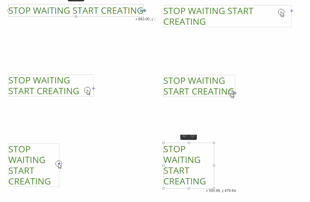
Let’s start by adding text to the page first. Select the Text Tool  in the toolbar (left side of the workspace). Click the middle of the board and type “STOP WAITING AND START CREATING.” Hit enter when you’re done. By immediately typing, you’re using the single-line text function, which has no bounds.
To create bounds, select your text box then click a control point and drag until “STOP WAITING AND START CREATING” are separated into four lines.
4. Adjust the text
A font filter section will appear in the editor. The font filter allows you to adjust the font size, font family, font weight, line height, letter spacing, and boundary alignment.
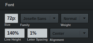
Change the font size to 72px by clicking the size box and typing in the number. Choose the Josefin Sans font family as well as a bold font weight. It’s important to note that all fonts are part of the Google font family, which means not all fonts have different types of weight. Finish up by setting the line height to 140% and the alignment to center.
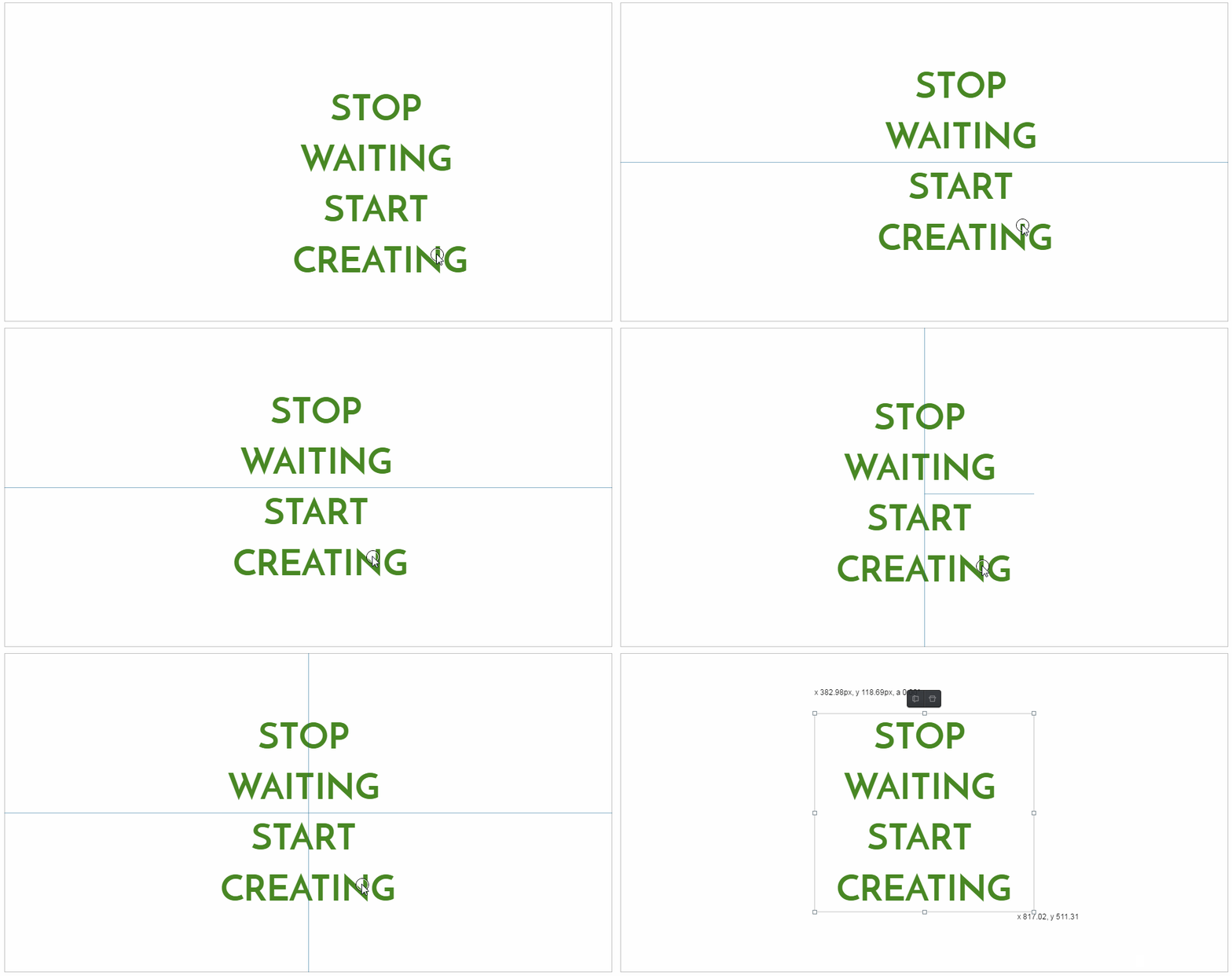
Resize the text box so that the text is centered within the text box. Then, align the text box to the center of the page by using the Snap Lines Tool on the top-left corner of the editor.
When you select the tool, a dropdown menu will appear. From top-to-bottom of the menu, you can choose whether you want to (1) use snap lines  , (2) use grid lines
  , or (3) use no lines whatsoever
  . To select an option, click on their corresponding buttons. Both snap and grid lines serve as visual aids and guidelines while you’re using the workspace, but there are key differences. Snap Lines are mostly for the alignment of your creations in relation to other images, texts, or shapes within the page. They show up as to perpendicular lines that help you snap your objects into place. Grid lines, on the other hand, are useful for the composition of your objects since they divide your page into equal sections. They appear as grey lines within the page background.
When both the perpendicular Snap Lines stretch across the entire page, you’ll know that your text box is right at the center of the page.
5. Add rectangular backgrounds to text
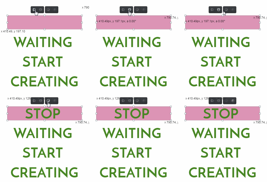
Moving on to the Rectangle Tool  ! We’re going to be creating four rectangles to place behind the four lines of text. So, select the first tool on the toolbar. Click on the board and try to highlight the first line, “STOP,” by dragging the rectangle across.
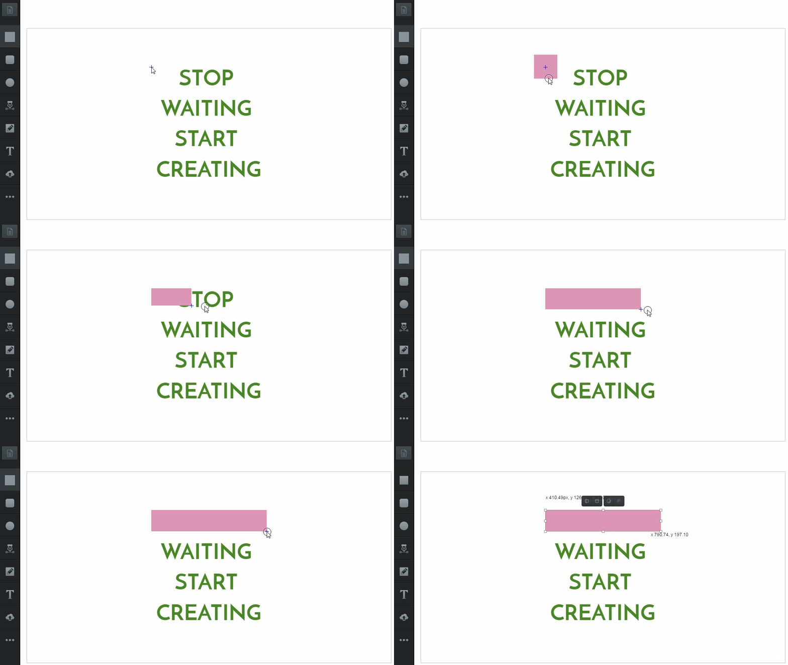
With the rectangle selected, you may notice four Overlay Tools  floating on top of it. The first set of overlay tools, on the left, flips your selection horizontally/vertically. The second set of overlay tools, on the right, sends your selection to the front/back. Hovering over overlay tools only provide a preview of its function, so you must click deploy. To send a selection all the way front/back, hold Shift when you select front/back overlay tools. Hovering over overlay tools only provide a preview of its function, so you must click deploy.
Bring the rectangle behind the text box by clicking the Send-back Overlay Tool  .
.
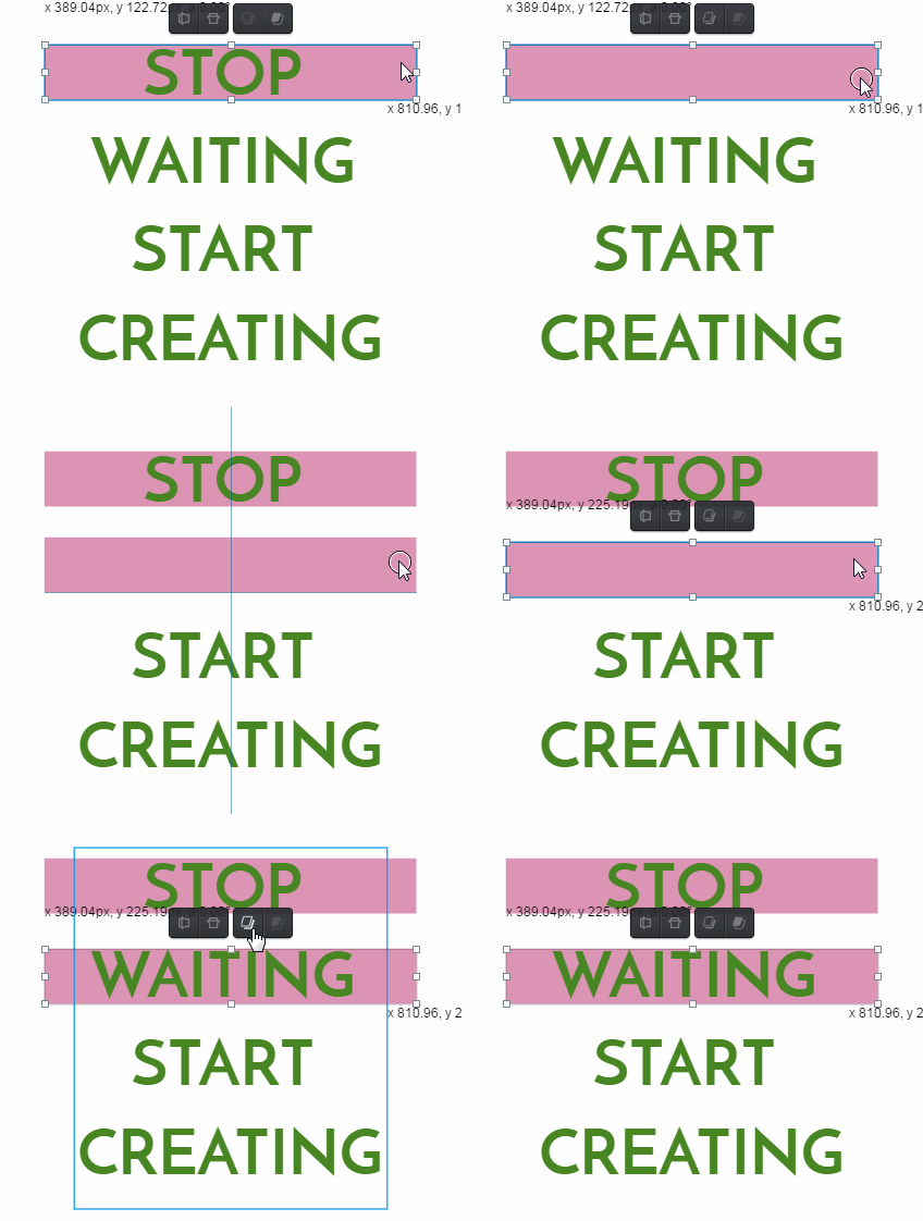
Copy the rectangle Ctrl + C and paste it Ctrl + V. Select and drag the pasted rectangle onto the second line, “WAITING.” Then, send the box back.
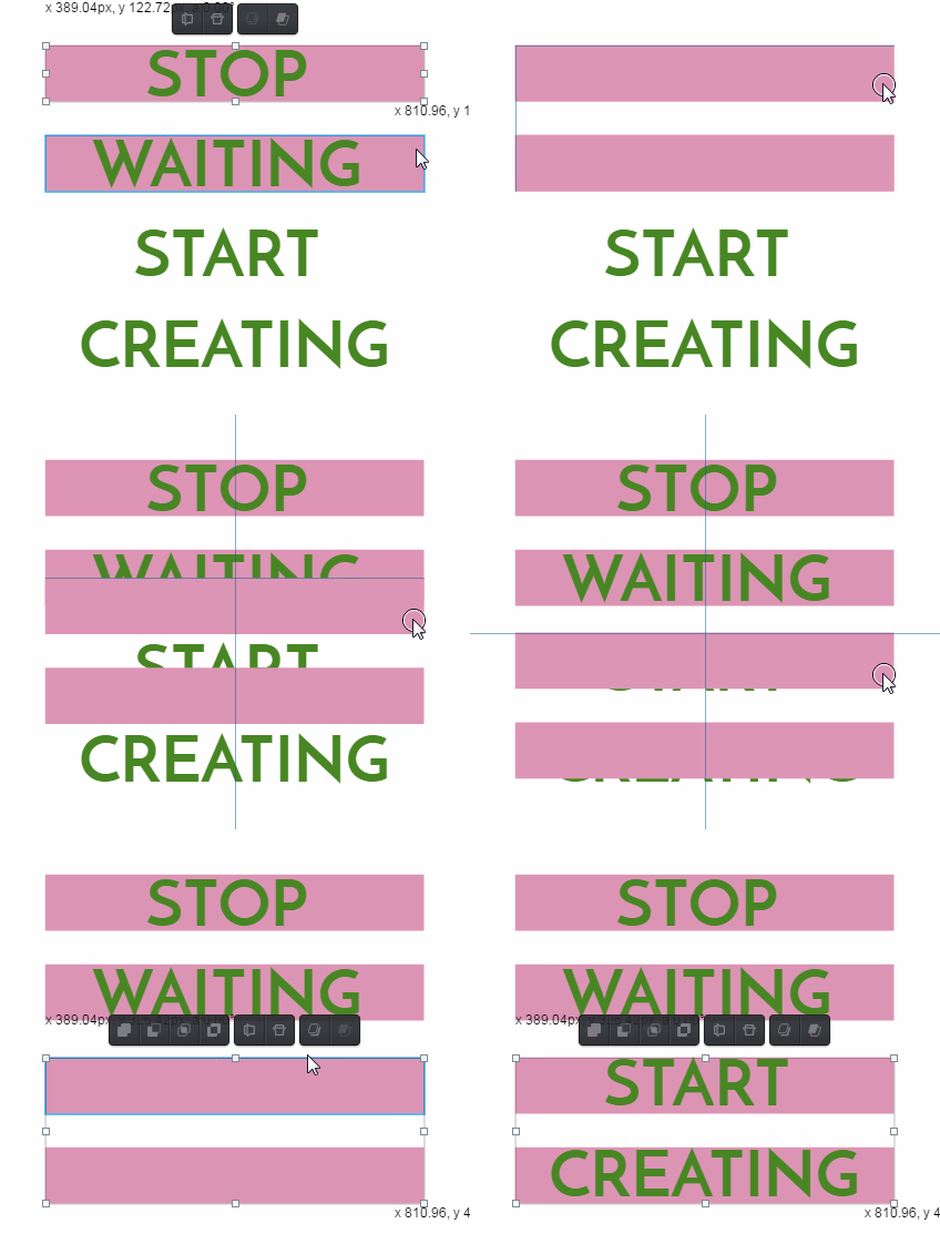
Hold Shift while making selections to choose more than one selection at a time. Select both rectangles to copy and paste. Then, drag the rectangles onto the remaining two lines. Send the rectangles to the back once the last two rectangles are in place.
6. Upload an image
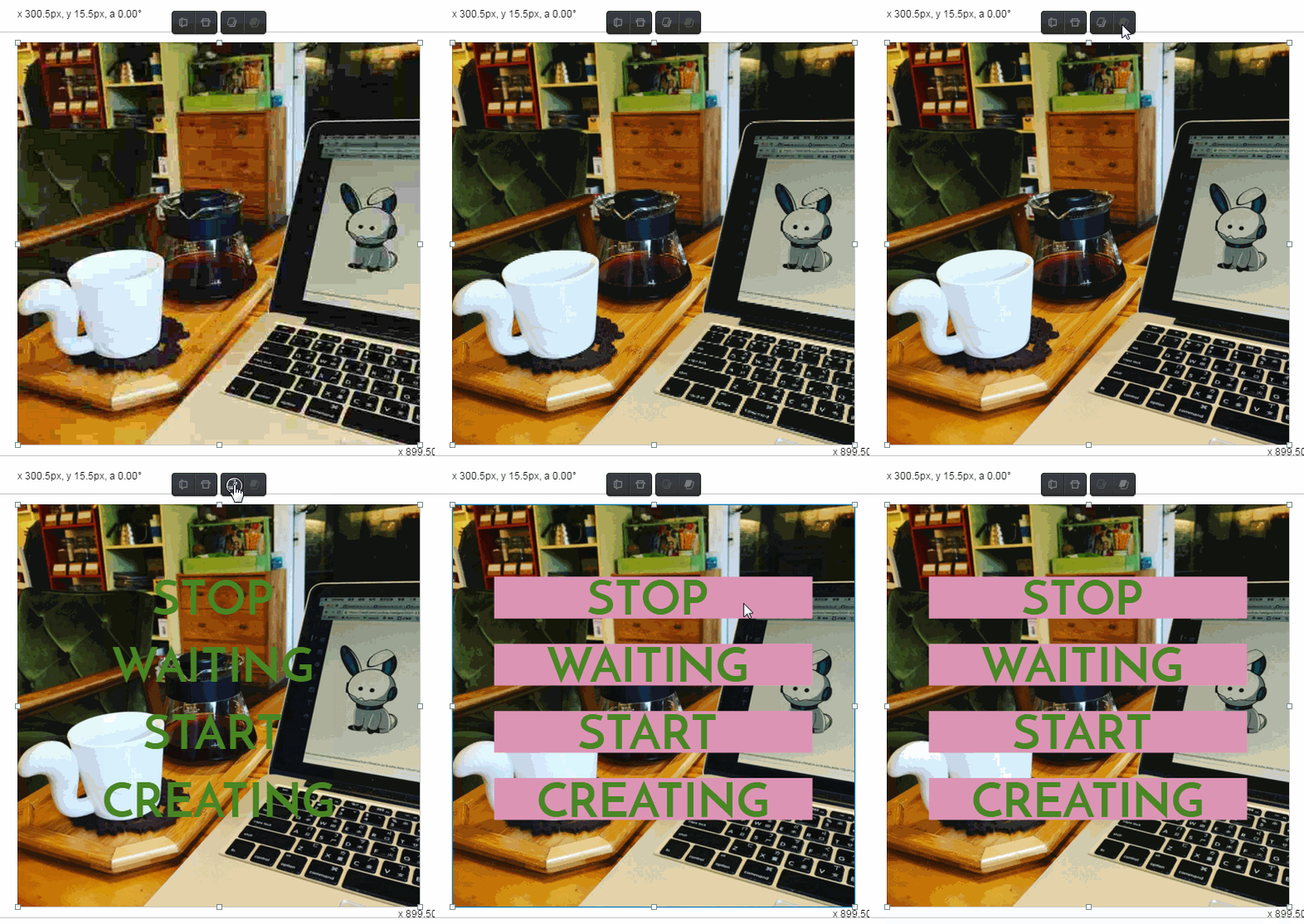
Now we’re going to work on the background of our image. Choose an image of your choice for your Facebook image quote. We chose an image taken by one of our team members here at Vectr. To upload an image, you can either drag the image from your desktop into the board or click on the Upload Image Button 
When an image is uploaded into the board a temporary blurry version of the image will appear first. Don’t worry! Behind-the-scenes, Vectr is working hard to produce a higher-resolution image, which will appear as soon as it’s finished processing. The wait time will depend on the quality of the image.
Once an image has been uploaded, send it all the way back. Remember, you can do this either by clicking on the Send-back Overlay Tool  multiple times or by holding Shift while you select the tool.
7. Adjust the image
Adjust the image to the page in your board according to your preference. You can adjust the image size by clicking and dragging the control points. To maintain image proportions while adjusting size, hold Shift while dragging.
8. Add an image background filter
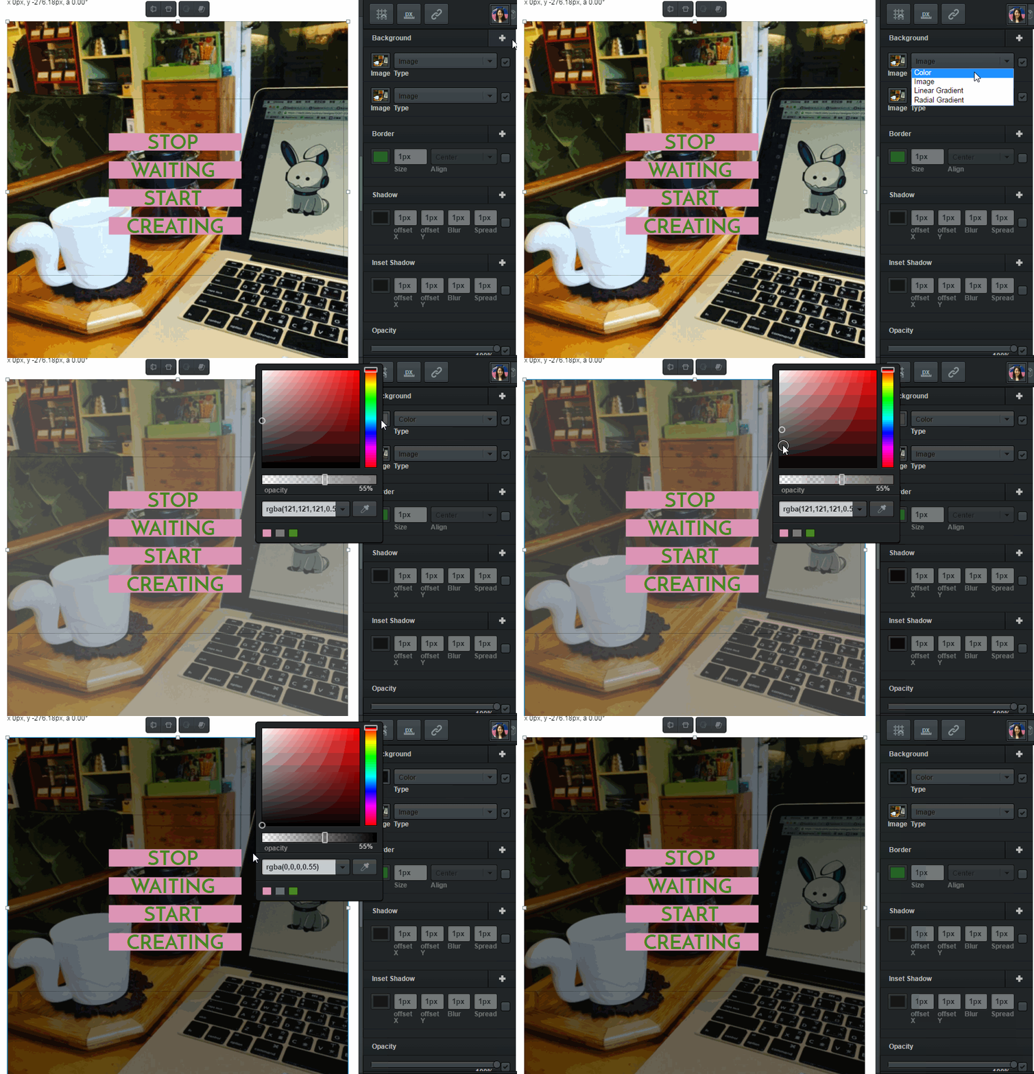
In addition to an image background filter, let’s apply a color background filter. Click the Add Filter Button  on the right side of the Background Filter section in the editor. A new filter will appear in this section. In the drop-down menu, select the Color background. Click the small color preview box on the left. A color selection menu will open up from the left of the editor. It allows you to set the color point’s hue [pure spectrum of color], tone [mixture of hue with black or white], and opacity [lack of transparency] with sliding adjusters and a tonesel
Let’s change the colors tone to black. You can do this by clicking and dragging the small color-stopper to the bottom-left in the tone selector. You may also adjust the opacity of the filter to your liking by using the opacity slider located below the tone selector. Click outside the color selection menu when you’re finished.
9. Adjust the colors
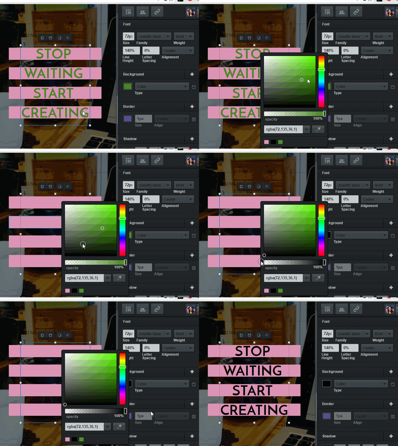
We’re almost done with the Facebook image quote. Just a few more color changes! Change the font color of the text by selecting the text box. Under the Background setting in the editor, click on the small color preview box. Change the color to black. It’s the same process as changing a background color filter, but make sure the opacity is set to 100%.
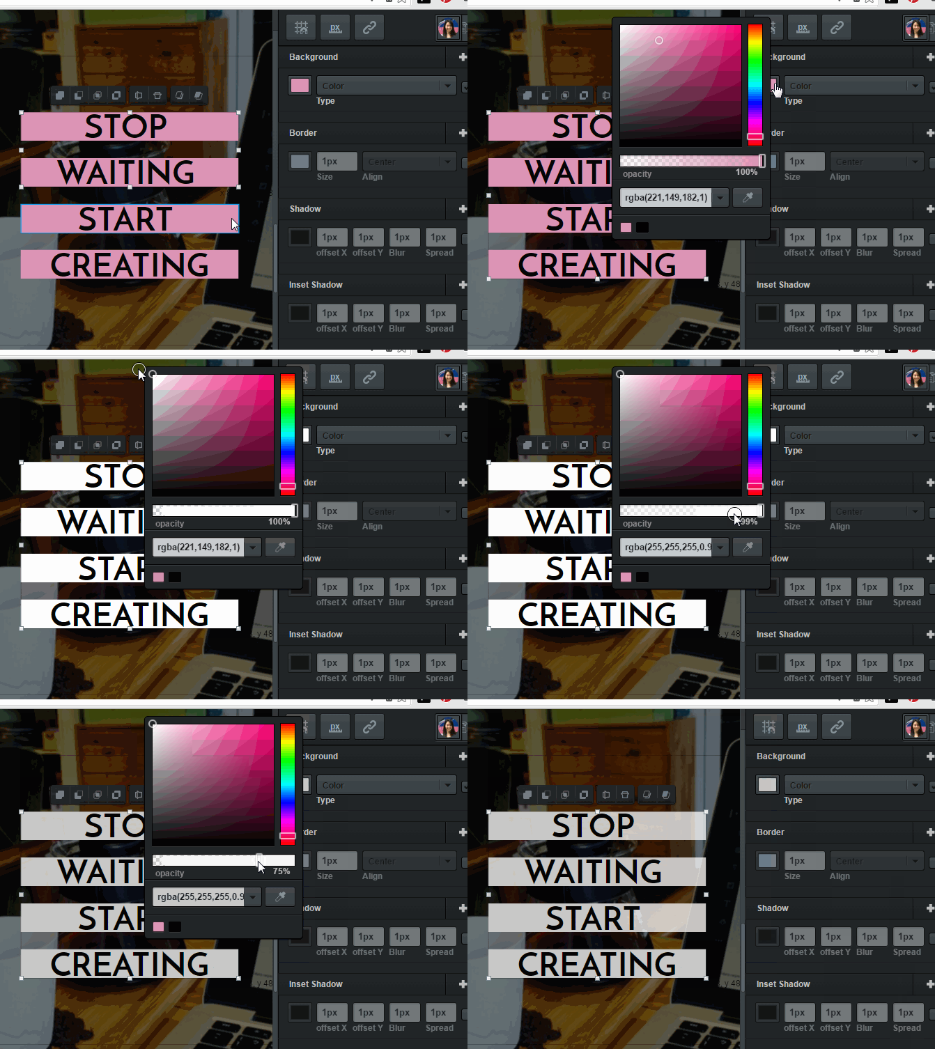
The last color change belongs to the four rectangles behind the text box. Select all four by holding Shift while clicking the boxes. Change the color of the rectangles to white, and set the opacity to 75%.
10. Export your page
Finally, you can export your Facebook image quote! Click the Export Image Button  located on top of the toolbar. Rename your file by clicking and typing in the file name section. Then, select Export and Download to save your creation.

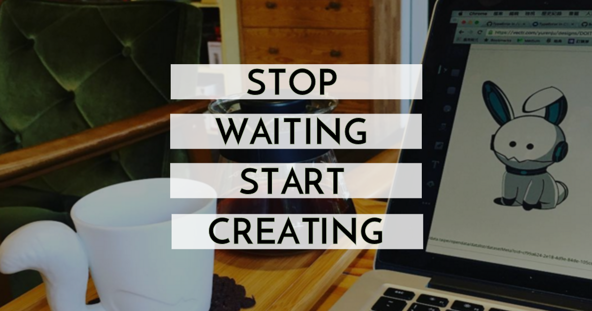
Congratulations! Your first creation with Vectr is now complete. That was easy, wasn’t it? This tutorial should provide you with enough basic knowledge for you to start creating with Vectr. Let us know how helpful it was in the comment section below or via social media! Share your creations on social media with us using #vectr. We’re working on many more tutorials, but suggestions are always welcome. Request a Tutorial Here
